
🌿 How to Use Color to Instantly Transform Your Garden’s Emotion
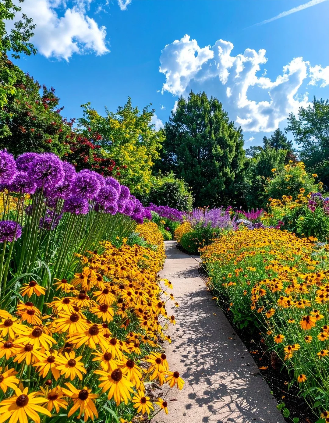
🌟 Introduction: Why Color Is the Fastest Way to Change a Garden’s Emotion
Before a visitor notices the layout of your garden…
Before they identify the plants…
Before they understand the design philosophy…
They feel the color story.
Color is the first language the brain processes in any space. In a garden, it doesn’t just decorate—it sets the emotional tone in seconds. A well-coordinated color palette can make a space feel:
Calm (soft greens and blues)
Vibrant (pops of red and orange)
Luxurious (deep purples and silvers)
Chaotic (clashing, unplanned hues)
Warm (golden yellows and terracotta)
Refreshing (crisp whites and mint greens)
A truly designed garden isn’t just green—it’s a living color system that evolves with the light, the seasons, and the layers of planting.
Color Wheel for Garden Design
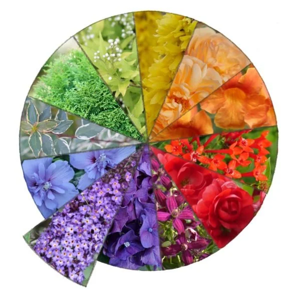
This comprehensive guide will teach you how to orchestrate color like a professional, using:
✅ Seasonal palettes to keep your garden dynamic year-round
✅ Harmony systems to ensure colors work together, not against each other
✅ Visual psychology principles to control mood and perception
✅ Pro-tested planting combinations for foolproof results
✅ Squarespace-ready HTML codes for all tables and diagrams
🎨 1. What Is Color Coordination in Landscape Design?
Color coordination is the intentional arrangement of plant and material colors to create visual harmony, emotional consistency, and a signature identity in outdoor spaces.
Simple Definition:
Color coordination is the emotional design of a garden—using plant tones, textures, and seasonal shifts to guide how people feel in the space.
Without Color Coordination:
❌ Random bursts of mismatched flowers
❌ Clashing shades of green (yes, greens can clash!)
❌ No visual identity—your garden blends into the neighborhood
❌ Seasonal confusion (e.g., spring colors lingering into summer)
With Color Coordination:
✅ Structured beauty – Every element has a purpose
✅ Emotional control – You decide if the garden feels energetic or serene
✅ Cohesive identity – Your garden looks intentional, not accidental
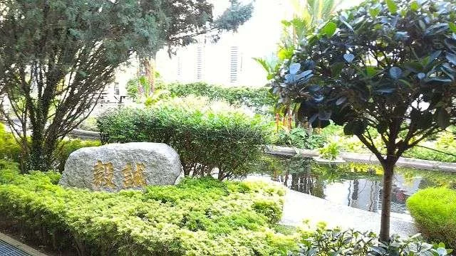
Monochromatic Green Garden with Different Shades of Green Foliage
A monochromatic garden uses variations of a single color (green) to create a sophisticated, calming effect. Notice how different shades and textures add depth without clutter.
The Color Hierarchy System (Visualized)
| Layer | Role | Percentage | Example |
|---|---|---|---|
| Base | Stability & continuity | 70% | Deep green shrubs, lawns, evergreens |
| Secondary | Neutral transitions | 20% | Silver foliage, soft gray stones, beige mulch |
| Accent | Seasonal highlights | 10% | Tulips, roses, Japanese maples, annuals |
🧠 2. The Psychology of Color in Gardens
How to Design for Mood, Not Just Looks
Colors don’t just look different—they feel different. The colors you choose can subconsciously influence how people experience your garden, from the moment they step inside.
Garden Color Psychology Infographic
Colors evoke specific emotions. Use this knowledge to design a garden that feels exactly how you want it to.
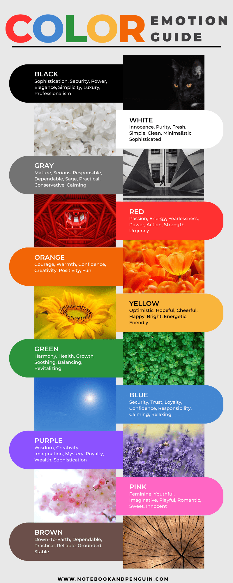
🌈 Emotional Impact of Colors
| Color | Emotional Effect | Best For | Plants to Use |
|---|---|---|---|
| 🟢 Green | Calm, balance, renewal, nature | Relaxation zones, meditation gardens | Boxwood, ferns, hostas, grass |
| 🔴 Red | Energy, passion, urgency, warmth | Entertainment areas, focal points | Roses, salvia, canna lilies |
| 🟡 Yellow | Happiness, optimism, warmth, cheer | Sunny borders, children’s play areas | Daffodils, coreopsis, black-eyed Susan |
| 🔵 Blue | Calmness, depth, coolness, serenity | Water features, shaded retreats | Hydrangeas, delphiniums, lobelia |
| 🟣 Purple | Luxury, creativity, mystery, spirituality | Formal gardens, artistic spaces | Lavender, allium, heuchera, orchids |
| ⚪ White | Cleanliness, purity, clarity, elegance | Modern gardens, moonlit spaces | White roses, shasta daisies, baby’s breath |
Key Insight:
Color doesn’t decorate a garden—it controls how it feels.
Use warm tones (red, orange, yellow) to energize a space, and cool tones (blue, purple, silver) to calm it.
Example:
A front yard with warm reds and yellows feels welcoming and social.
A backyard retreat with cool blues and purples feels private and tranquil.
🌳 3. The Base Rule of Landscape Color Design
The 70-20-10 Rule for Gardens
Every great garden color system starts with a dominant green base. Here’s why:
Why Green Is Non-Negotiable
✔ Most stable visual element – Greens anchor the eye, even as flowers come and go.
✔ Reduces visual fatigue – Acts as a "resting place" for the eyes between bold colors.
✔ Connects all other colors – Green is the bridge between warm and cool tones.
✔ Changes subtly with light and season – Spring greens are bright; summer greens are deep; autumn greens turn golden.
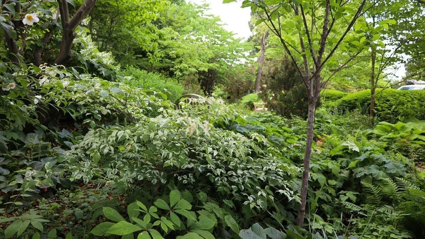
Beautiful Garden with Layered Planting: Canopy, Shrubs, Groundcover
Layered planting creates depth and visual interest. The green base (70%) provides stability, while seasonal colors (10%) add pops of interest.
The 70-20-10 Color Hierarchy
LayerRolePercentageExampleBase (Green)Stability & continuity70%Lawns, shrubs, evergreens, hedgesSecondaryNeutral transitions20%Silver foliage, gray stones, mulchAccentSeasonal highlights10%Flowers, colorful bark, ornaments
Pro Tip:
If your garden feels chaotic, you’re likely overusing accent colors. Cut back to 10% or less and let the greens dominate.
🎨 4. Color Harmony Systems in Landscape Design
How to Make Colors Work Together (Not Fight Each Other)
Harmony systems are rules for combining colors so they feel intentional, not random. Here are the 4 essential systems, with real-world examples and images:
1️⃣ Monochromatic Harmony: The Elegance of Simplicity
How it works:
Uses variations of one hue (light, medium, dark, or muted versions) to create a sophisticated, calming effect. This is the easiest harmony system for beginners because it’s impossible to clash—you’re only using one color!
Why it’s powerful:
Creates a cohesive, unified look that feels intentional and polished.
Works beautifully in modern, minimalist, or formal gardens.
Low-maintenance—fewer plant types to manage.
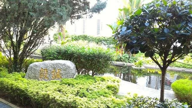
Monochromatic Green Garden
A monochromatic garden using only green foliage in different shades and textures. The variation in tone and form keeps it interesting without introducing new colors.
Example Palette:
Light green (lime heuchera)
Medium green (boxwood)
Dark green (inkberry holly)
Yellow-green (golden hosta)
Effect:
✅ Calm
✅ Minimalist
✅ Sophisticated
✅ Timeless
Best for:
Modern gardens
Zen spaces
Low-maintenance landscapes
Shaded areas
Pro Planting Combos:
"Emerald Carpet": ‘Lime Rickey’ heuchera + ‘Green Velvet’ boxwood + ‘Color Guard’ yucca
"Forest Layers": Tall ‘Emerald Green’ arborvitae + mid-height ‘Green Giant’ boxwood + low ‘Lime Creep’ thyme
2️⃣ Analogous Harmony: Nature’s Favorite Palette
How it works:
Uses 2-3 colors next to each other on the color wheel. These colors blend naturally, just like in a sunset or a forest.
Why it’s powerful:
Feels effortless and organic—like nature designed it.
Creates a sense of flow and movement through the garden.
Warm and inviting—perfect for social spaces.
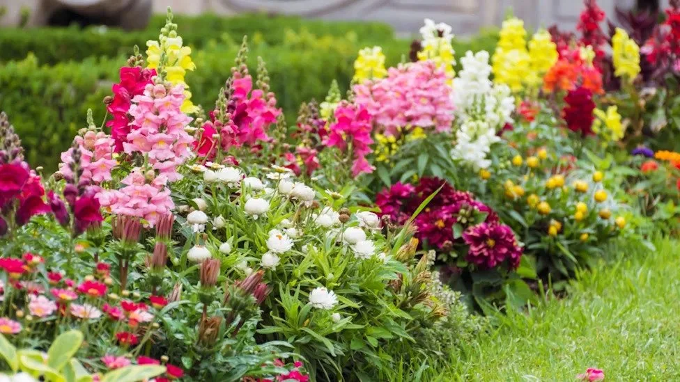
Analogous Color Garden: Yellow, Orange, Red Flowers
Analogous colors (yellow, orange, red) create a natural, flowing effect. This combination mimics the colors of a sunset and feels warm and inviting.
Example Palette:
Yellow (coreopsis)
Orange (marigolds)
Red (salvia)
Effect:
✅ Natural flow
✅ Warm, inviting feel
✅ Feels "effortless"
Best for:
Cottage gardens
Meadow-style plantings
Sunny borders
Pollinator gardens
Pro Planting Combos:
"Sunset Border": ‘Moonbeam’ coreopsis (pale yellow) + ‘Profusion Orange’ zinnias + ‘Hot Lips’ salvia (red)
"Autumn Glow": ‘Stella de Oro’ daylilies (yellow) + ‘Autumn Joy’ sedum (pinkish-red) + ‘Henry Eiler’ sweet coneflower (yellow)
"Fiery Drift": ‘Blanket Flower’ (Gaillardia, red/yellow) + ‘Black-Eyed Susan’ (Rudbeckia, golden yellow) + ‘Red Hot Poker’ (Kniphofia, red/orange)
3️⃣ Complementary Harmony: The Power of Opposites
How it works:
Uses opposite colors on the color wheel for maximum impact. When placed side by side, complementary colors amplify each other’s intensity, making both appear more vibrant and luminous.
Why it’s powerful:
Creates instant focal points—visitors’ eyes are naturally drawn to these pairings.
High-energy—perfect for spaces that need a jolt of excitement.
Dramatic and bold—makes a strong visual statement.
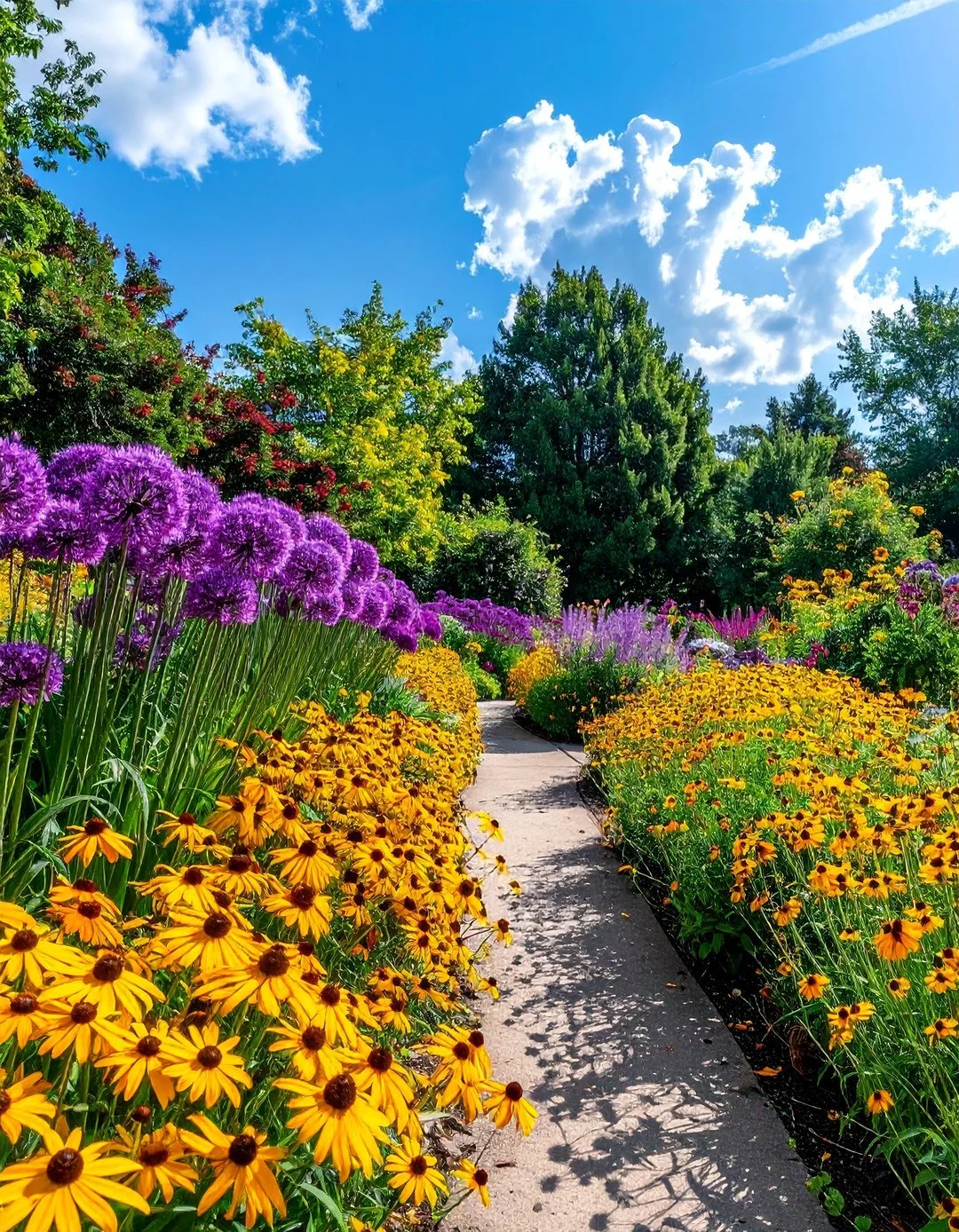
Vibrant Garden with Purple and Yellow Flowers
Complementary colors at their best: Purple lavender and yellow coreopsis create a vibrant, eye-catching contrast that feels both elegant and lively.
Example Palettes:
💜 Purple + Yellow: The Regal & Cheerful Duo
This is one of the most naturally occurring complementary pairs in the plant world, and for good reason—it feels both sophisticated and joyful at the same time.
Why it works:
Purple, with its cool, royal undertones, provides a rich, velvety backdrop that makes yellow appear to glow like sunlight. The contrast is so strong that even small pops of each color create a powerful visual statement. Purple also has a calming effect, while yellow injects optimism and warmth, creating a balanced emotional experience.Best plant combinations:
Lavender (Purple) + Coreopsis (Yellow): A classic cottage garden combo. The silvery-green foliage of lavender softens the contrast, while the daisy-like blooms of coreopsis add a playful touch.
Allium (Deep Purple) + Black-Eyed Susan (Golden Yellow): The spherical purple globes of allium contrast beautifully with the flat, sunny faces of Rudbeckia, creating a sculptural effect.
Salvia ‘May Night’ (Violet-Purple) + Daylilies (Lemon Yellow): The vertical spikes of salvia rise above the strappy daylily leaves, adding height and structure to the pairing.
Design tips:
Use purple as the dominant color (e.g., a hedge of purple-leaved plants like ‘Royal Purple’ smokebush or ‘Purple Prince’ zinnia) and yellow as the accent (e.g., scattered ‘Moonbeam’ coreopsis or ‘Stella de Oro’ daylilies).
For a modern look, plant in geometric blocks (e.g., a square of purple salvia bordered by yellow marigolds).
For a naturalistic look, interplant purple and yellow flowers in drifts to mimic a wildflower meadow.
Mood it creates:
Elegant yet lively—perfect for gardens that need to feel both refined and welcoming. This palette works especially well in formal gardens, cutting gardens, and pollinator-friendly spaces (bees and butterflies adore both colors!).
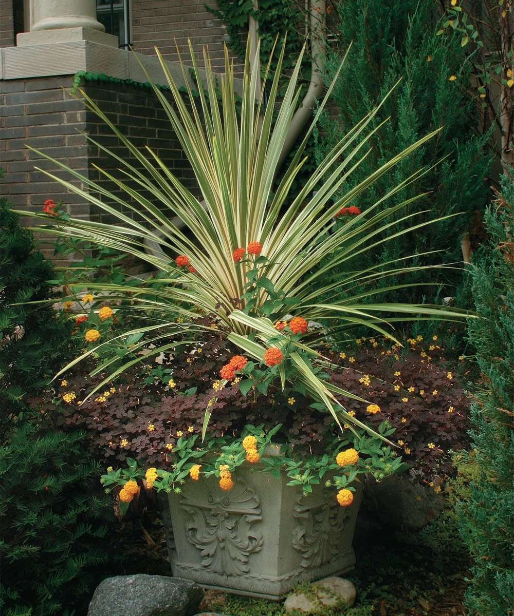
Best plant combinations:
Delphinium (True Blue) + Marigolds (Fiery Orange): The tall, spiky delphiniums provide vertical drama, while the compact marigolds fill the lower layer with bold color.
Hydrangeas (Blue) + Zinnias (Orange): In acidic soil, hydrangeas turn a stunning blue, which contrasts gorgeously with the hot orange of ‘Profusion Orange’ zinnias.
Nepeta ‘Walker’s Low’ (Lavender-Blue) + Calendula (Golden Orange): The soft, silvery foliage of nepeta softens the intensity of the orange calendula, creating a balanced, cottage-garden feel.
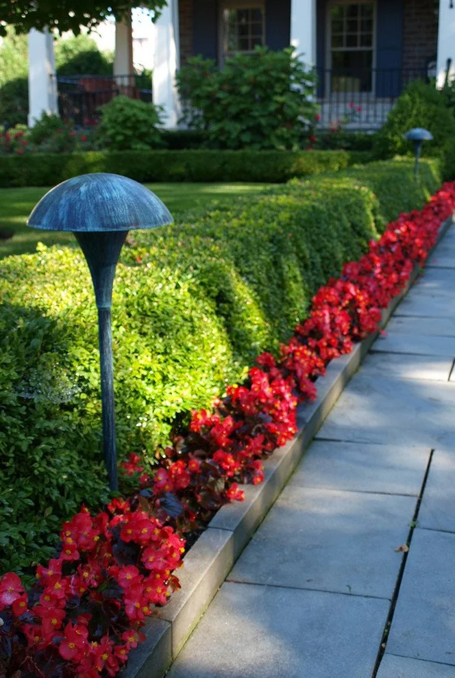
Elegant Garden with Red Roses and Green Boxwood Hedges
Red and green: a timeless combination. Red roses pop against the deep green of boxwood hedges, creating a sophisticated, elegant look.
Effect of Complementary Colors:
✅ Strong contrast – The visual impact is immediate and powerful, creating a vibration effect that makes both colors appear more intense.
✅ Visual excitement – Injects energy and dynamism, making the garden feel alive and engaging.
✅ Draws the eye to focal points – Perfect for highlighting entrances, seating areas, or garden features.
Best for:
Feature gardens – Dedicated planting areas designed to steal the spotlight.
Small spaces – The strong contrast can make small gardens feel larger by creating depth and dimension.
Modern or contemporary designs – The bold, graphic nature aligns with minimalist aesthetics.
4️⃣ Triadic Harmony: The Dynamic Trio
How it works:
Uses three colors evenly spaced on the color wheel (e.g., red, yellow, blue). This creates a vibrant, balanced palette that’s more complex than complementary but still harmonious.
Why it’s powerful:
Visually exciting—more dynamic than two-color schemes.
Balanced—the three colors work together without one dominating.
Versatile—can be bold or subtle depending on saturation.
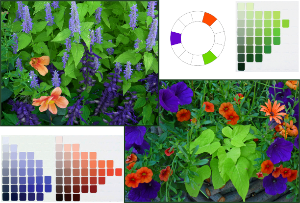
Triadic Color Garden: Red, Yellow, Blue Flowers
Triadic harmony uses three evenly spaced colors on the color wheel. Here, red, yellow, and blue create a vibrant yet balanced look.
Example Palette:
Red (tulips)
Yellow (daffodils)
Blue (hyacinths)
Effect:
✅ Dynamic
✅ Vibrant
✅ Balanced
Best for:
Spring bulb gardens
Annual flower beds
Playful, eclectic spaces
Pro Planting Combos:
"Primary Pop": ‘Red Emperor’ tulips + ‘Tête-à-Tête’ daffodils + ‘Blue Jacket’ hyacinths
"Jewel Tones": ‘Blue Star’ amsonia + ‘Goldsturm’ black-eyed Susan + ‘Red Hot Poker’ kniphofia
"Rainbow Border": Red salvia + yellow coreopsis + blue delphinium
📊 Harmony System Comparison
| Harmony System | Colors Used | Effect | Best For | Difficulty |
|---|---|---|---|---|
| Monochromatic | 1 hue (light to dark) | Calm, minimal, sophisticated | Modern gardens, zen spaces | ⭐ Easy |
| Analogous | 2-3 adjacent colors | Natural, warm, flowing | Cottage gardens, meadows | ⭐⭐ Easy |
| Complementary | Opposite colors | Bold, high-contrast, dramatic | Feature gardens, small spaces | ⭐⭐⭐ Moderate |
| Triadic | 3 evenly spaced colors | Dynamic, vibrant, balanced | Spring bulbs, annual beds | ⭐⭐⭐⭐ Advanced |
🌸 5. Seasonal Color Palettes in Gardens
How to Keep Your Garden Stunning Year-Round
A garden’s color story shouldn’t be static—it should evolve with the seasons. Here’s how to design for year-round emotional impact:
🌱 Spring Palette: Freshness & Renewal
Colors:
Soft greens (new growth)
Pastel pinks (blossoms)
Butter yellows (daffodils)
Cream whites (magnolias)
Mood:
✨ Fresh, hopeful, delicate
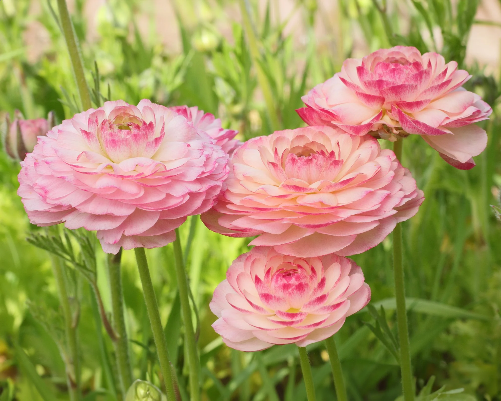
Spring Garden with Soft Pink and Yellow Blossoms
Spring gardens should feel light and airy. Soft pinks, yellows, and whites create a sense of renewal and freshness.
Pro Planting Combo:
"Spring Awakening" –
‘Iceberg’ roses (white)
‘Sarah Bernhardt’ peonies (pink)
‘Tête-à-Tête’ daffodils (yellow)
‘Limelight’ hydrangeas (soft green)
Squarespace Design Tip:
Use a light, airy color scheme for spring blog posts or garden photos to match the season’s mood.
☀️ Summer Palette: Energy & Vibrancy
Colors:
Deep greens (mature foliage)
Fiery reds (roses, salvia)
Sunny oranges (marigolds, zinnias)
Electric blues (delphiniums)
Mood:
🔥 Bold, lively, abundant
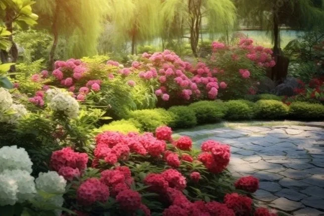
Summer Garden with Deep Greens and Bright Red Flowers
Summer gardens are all about energy and vibrancy. Deep greens provide a rich backdrop for bright, saturated flowers.
Pro Planting Combo:
"Summer Fiesta" –
‘Double Delight’ roses (red + white)
‘Profusion Orange’ zinnias
‘Blue Horizon’ agastache
‘Black Adder’ agastache (deep purple)
Squarespace Design Tip:
For summer garden features, use warm, saturated colors in your website’s accent buttons or borders.
🍂 Autumn Palette: Warmth & Maturity
Colors:
Rich browns (falling leaves)
Golden yellows (birch trees)
Burnt oranges (mums, pumpkins)
Deep reds (maple leaves)
Mood:
🍁 Cozy, nostalgic, rich
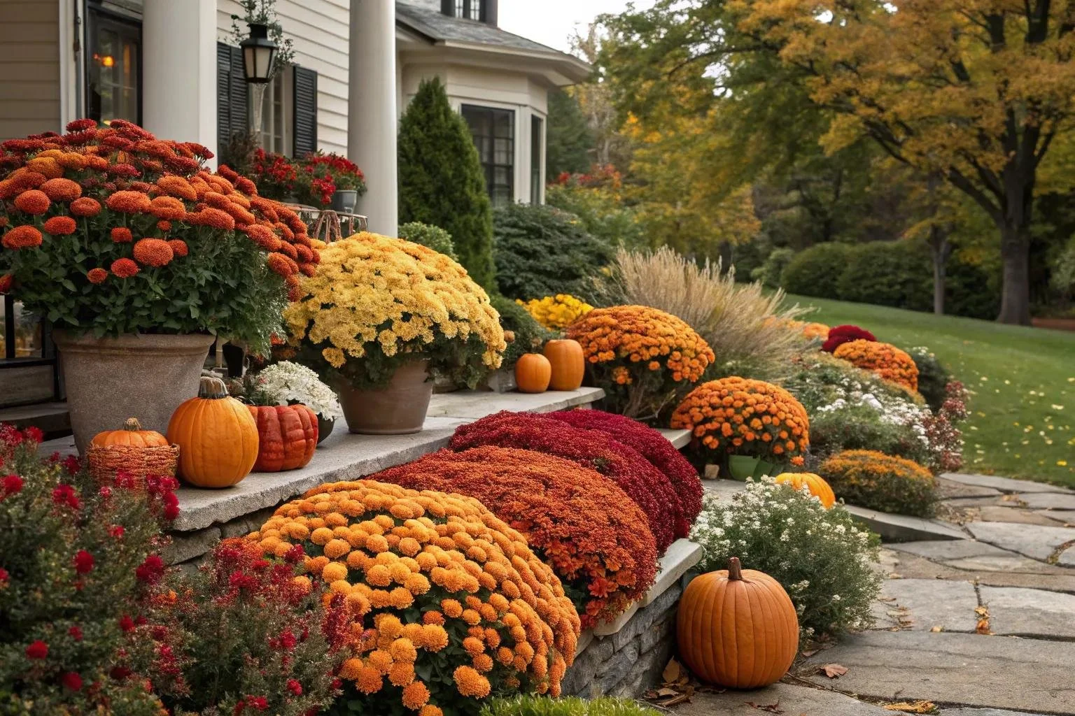
Autumn Garden with Warm Browns, Gold, and Burnt Orange Foliage
Autumn gardens should feel warm and inviting. Rich browns, golds, and oranges create a cozy, nostalgic atmosphere.
Pro Planting Combo:
"Autumn Glow" –
‘Autumn Joy’ sedum (pinkish-red)
‘Henry Eiler’ sweet coneflower (yellow)
‘Brandywine’ asters (deep purple)
Japanese maple (red foliage)
Squarespace Design Tip:
Use earthy tones (terracotta, mustard, deep green) in your autumn garden content.
❄️ Winter Palette: Calm & Elegance
Colors (for mild climates):
Muted greens (evergreens)
Silvers (dusty miller, lamb’s ear)
Whites (snow, birch bark)
Deep purples (heather, hellebores)
Mood:
❄️ Serene, minimal, timeless
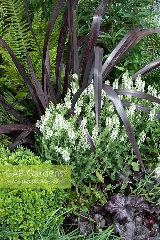
Winter Garden with Evergreens, Silver Foliage, and Structural Plants
Winter gardens rely on texture and structure. Evergreens, silver foliage, and architectural plants create a calm, elegant look.
Pro Planting Combo:
"Winter Whisper" –
‘Silver Dust’ dusty miller
‘Christmas Rose’ hellebore (white)
‘Blue Spruce’ Colorado spruce
‘Firepower’ nandina (red berries)
Squarespace Design Tip:
For winter garden features, use cool, muted colors (grays, whites, deep blues) in your design.
🌿 Seasonal Transition Diagram
🌸 Spring
Soft greens, pastel pinks, light yellows
Mood: Freshness, renewal
☀️ Summer
Deep greens, bright reds, strong oranges
Mood: Energy, vibrancy
🍂 Autumn
Warm browns, gold tones, burnt oranges
Mood: Warmth, maturity
❄️ Winter
Muted greens, silvers, structural plants
Mood: Calm, elegance
🎯 6. Color Distribution in Planting Design
Where to Place Colors for Maximum Impact
Color isn’t just about which hues you use—it’s about where you place them. Here’s how to distribute color like a pro:
📐 The 4-Layer Color Distribution System
| Layer | Height | Color Role | Example Plants | Purpose |
|---|---|---|---|---|
| Canopy | Tall (10ft+) | Deep green base | Oak trees, maples, pines | Creates shade & structure |
| Mid Layer | Medium (3-8ft) | Seasonal flowering color | Hydrangeas, roses, lilacs | Adds seasonal interest |
| Ground Layer | Low (0-2ft) | Soft green continuity | Hostas, ferns, creeping thyme | Fills gaps, suppresses weeds |
| Accents | Any height | High-impact highlights | Tulips, annuals, ornamental grasses | Creates focal points |
Garden Planting Layers: Canopy, Mid, Ground, Accents
Layered planting creates depth and visual interest. Tall canopy trees provide structure, mid-layer shrubs add seasonal color, ground covers fill gaps, and accents create focal points.
Pro Tip:
Tall plants (canopy) should be your darkest greens for stability.
Mid-layer plants (shrubs, perennials) are where you add seasonal color.
Ground layer should be lighter greens or neutral tones to connect everything.
Accents (flowers, ornaments) are your 10% pop of color—use them sparingly for maximum impact.
🔥 7. Warm vs. Cool Garden Color Systems
How to Set the Emotional Temperature of Your Space
The temperature of your color palette determines how the garden feels. Choose warm for energy, cool for calm.
🌡️ Warm Garden Color System
Colors:
Reds
Oranges
Yellows
Warm browns
Effect:
✅ Energetic
✅ Inviting
✅ Social
✅ Stimulating
Best For:
Entertainment areas (patios, outdoor kitchens)
Front yards (welcoming first impressions)
Children’s play spaces (fun and lively)
Pro Planting Combo:
"Sunset Patio" –
‘Knock Out’ roses (red)
‘Blanket Flower’ (Gaillardia, red + yellow)
‘Blue Fescue’ grass (for contrast)
Terracotta pots (warm neutral)
❄️ Cool Garden Color System
Colors:
Blues
Purples
Silvery greens
Whites
Effect:
✅ Calming
✅ Relaxing
✅ Private
✅ Meditative
Best For:
Backyard retreats (reading nooks, meditation spaces)
Shaded gardens (cool tones thrive in low light)
Water features (blues and purples complement water)
Pro Planting Combo:
"Moonlit Retreat" –
‘Endless Summer’ hydrangeas (blue/purple)
‘Lavender’ (purple)
‘Dusty Miller’ (silver)
‘White Shasta Daisy’
📊 Warm vs. Cool Comparison
| Aspect | Warm Gardens | Cool Gardens |
|---|---|---|
| Primary Colors | Red, Orange, Yellow, Brown | Blue, Purple, Silver, White |
| Emotional Effect | Energetic, Social, Inviting | Calm, Relaxing, Private |
| Best Light Conditions | Full sun to partial shade | Partial shade to full shade |
| Ideal Spaces | Patios, Front Yards, Play Areas | Retreats, Water Features, Shaded Nooks |
| Accent Metals | Copper, Brass, Terracotta | Stainless Steel, Silver, White |
| Hardscaping Materials | Red brick, Golden gravel, Warm wood | Slate, Gray stone, White pebbles |
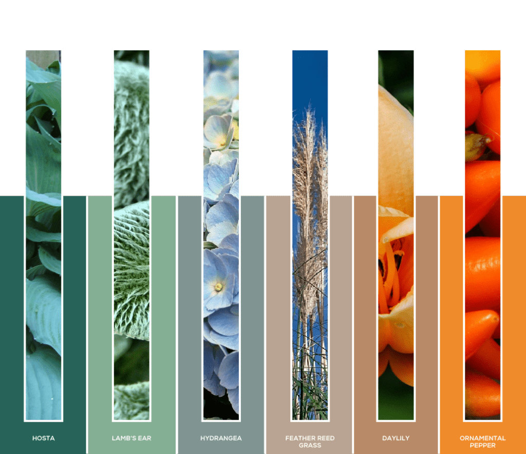
Warm vs Cool Garden Color Palette Co
mparisonWarm colors (reds, oranges, yellows) create energy and excitement, while cool colors (blues, purples, greens) evoke calm and relaxation.
🎭 8. Color Contrast and Visual Impact
How to Control the "Volume" of Your Garden
Contrast is what makes a garden pop—or fade into the background. Here’s how to use it intentionally:
🔍 3 Types of Contrast
TypeDefinitionExampleEffectHue ContrastDifferent colorsRed flowers + green foliageBold, eye-catchingLight ContrastLight vs. darkWhite flowers + dark mulchDramatic, high-impactTexture ContrastDifferent leaf shapesFine ferns + bold hostasDynamic, layered look
📊 Contrast Impact Scale
Contrast Intensity Spectrum
Soft, blended garden
(Monochromatic, analogous)
Bold, dramatic garden
(Complementary, triadic)
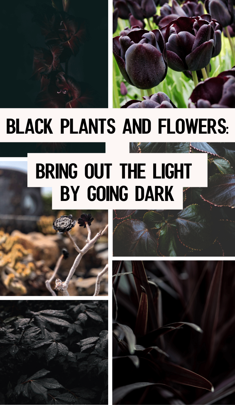
Garden Color Contrast Examples: Light and Dark Plants
Light contrast in action: Dark foliage makes light flowers stand out dramatically. Here, black plants create a striking backdrop for brighter blooms.
Pro Tip:
Low contrast = Relaxing (e.g., a green-and-white garden)
High contrast = Exciting (e.g., purple and yellow flower beds)
Medium contrast = Balanced (e.g., analogous colors with one accent)
🗺️ 9. Color Zoning in Landscape Design
How to Create Different Moods in Different Areas
Just like rooms in a house, different zones in your garden can have different color identities. This creates visual interest and emotional variety.
🏡 Example Garden Zoning
| Zone | Color Strategy | Primary Colors | Mood | Plant Examples |
|---|---|---|---|---|
| Entrance | Bright & Welcoming | Red, Yellow, Orange | Inviting, energetic | Roses, marigolds, coreopsis |
| Transition Path | Neutral Flow | Green, White, Silver | Calm, guiding | Boxwood, dusty miller, white alyssum |
| Lounge Area | Soft & Calming | Blue, Purple, Silver | Relaxing, private | Lavender, hydrangeas, lamb’s ear |
| Feature Corner | High-Contrast Accents | Purple + Yellow (complementary) | Dramatic, eye-catching | Allium, coreopsis, ornamental grass |
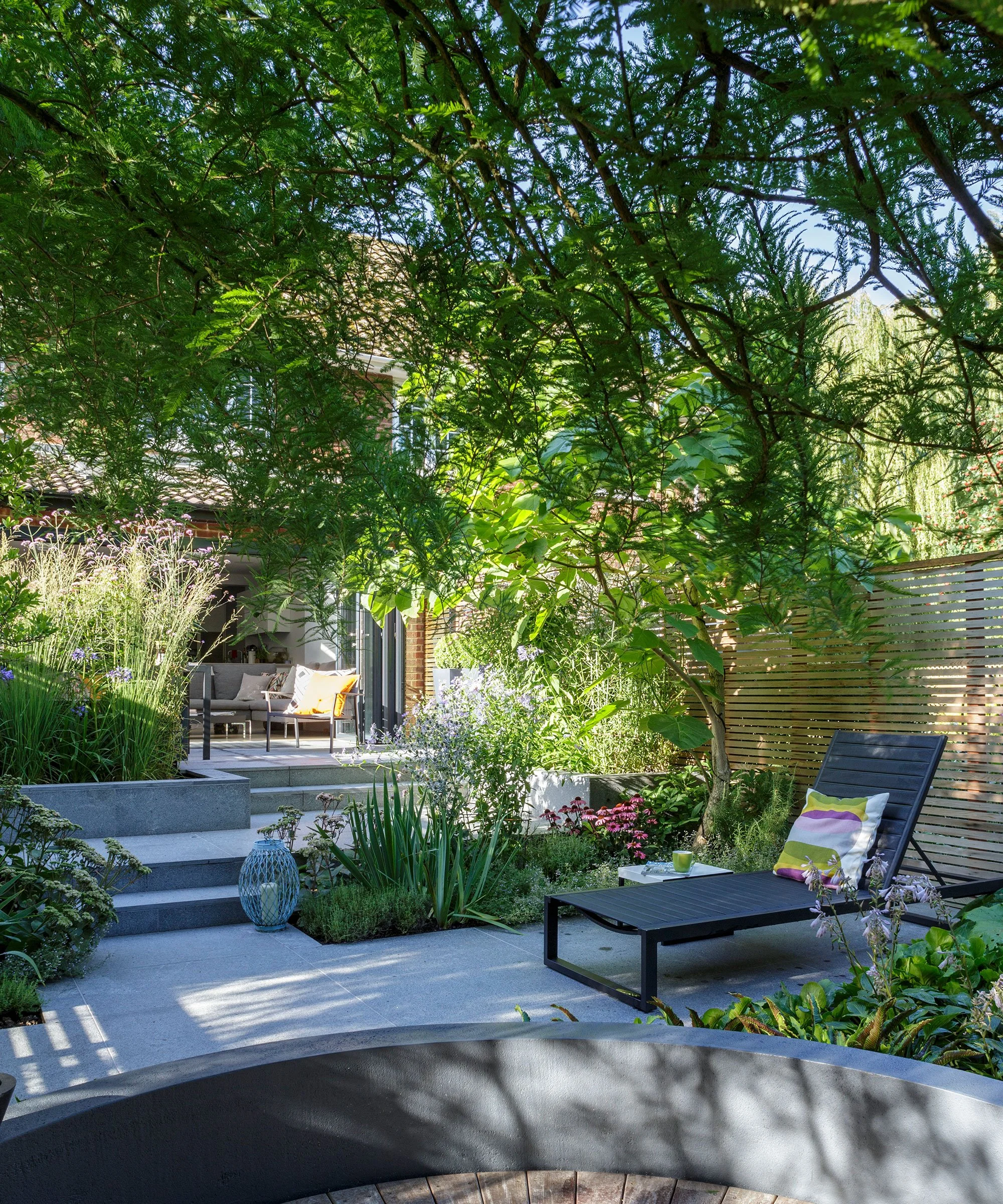
Garden Color Zoning Example with Different Areas
Color zoning creates different moods in different areas. This garden uses distinct color palettes to define separate spaces.
🗺️ Visual Zoning Diagram
❌ 10. Common Colour Mistakes in Gardens (And How to Fix Them)
Garden with Common Color Mistakes: Too Many Colours
Too many colors without a plan can create visual chaos. This garden has clashing hues that compete for attention.
MistakeResultFixToo many colorsVisual chaosStick to 3-5 colors maxNo base green structureWeak cohesionEnsure 70% green (shrubs, lawn, trees)Ignoring season changesInconsistent lookPlan year-round colorOverusing bright flowersVisual fatigueLimit accents to 10%No repetitionLack of harmonyRepeat 1-2 colors throughoutClashing greensUnintentional messUse 1-2 types of green foliageRandom color placementNo focal pointsGroup colors intentionally
Pro Tip:
If your garden feels off, it’s usually because of one of these 3 issues:
Too many colors (simplify!)
No green base (add structure)
Poor distribution (group, don’t scatter)
🏡 11. Real-World Color Design Example: A Residential Garden Plan
Let’s apply everything we’ve learned to a real garden layout.
📋 Garden Color Plan for a Suburban Home
| Area | Color Strategy | Primary Colors | Plant Selections | Harmony System |
|---|---|---|---|---|
| Front Yard | Warm & Welcoming | Red, Yellow, Green |
- ‘Knock Out’ roses (red) - ‘Stella de Oro’ daylilies (yellow) - ‘Green Velvet’ boxwood (base) |
Analogous (red-yellow) |
| Lawn | Deep Green Base | Green | Kentucky bluegrass, clover | Monochromatic |
| Backyard Seating Area | Cool & Calming | Blue, Purple, Silver |
- ‘Endless Summer’ hydrangeas (blue/purple) - ‘Lavender’ - ‘Dusty Miller’ (silver) |
Analogous (blue-purple) |
| Feature Corner (Near Patio) | High-Contrast Accent | Purple + Yellow |
- ‘Black Adder’ agastache (purple) - ‘Sunny Delight’ coreopsis (yellow) |
Complementary |
| Pathway Borders | Neutral Transition | White, Silver, Soft Green |
- White alyssum - Dusty miller - Creeping thyme |
Monochromatic (white/silver) |
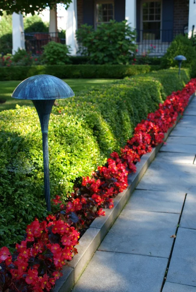
Elegant Garden with Red Roses and Green Boxwood Hedges
A real-world example of color zoning: Warm red roses in the front yard create a welcoming entrance, while cool tones in the backyard offer a calming retreat.
Result:
A balanced, emotionally layered garden that:
✅ Feels intentional (not random)
✅ Guides visitors through color zones
✅ Looks stunning in every season
✅ Maintains visual harmony
🎶 12. Advanced Concept: Color Rhythm in Gardens
How to Create Flow with Repeating Colors
Color rhythm is the repetition of colors across space to create visual movement and cohesion. Think of it like a melody in music—your eye follows the pattern.
🎵 3 Types of Color Rhythm
Repetition Rhythm
How it works: The same color appears at regular intervals.
Example: Red tulips planted every 3 feet along a border.
Effect: Creates order and predictability.
Gradual Transition Rhythm
How it works: Colors slowly shift from one to another.
Example: A flower bed that goes from white → pink → red roses.
Effect: Feels natural and flowing.
Cluster Rhythm
How it works: Colors are grouped in pockets.
Example: A cluster of blue hydrangeas, then a cluster of white daisies.
Effect: Creates drama and surprise.
🎨 Rhythm Diagram (Repetition Example)
Repetition Rhythm Example
Red flowers (🌷) repeated at intervals with green foliage (🌿)
Color Rhythm in Garden Design: Repetition Pattern
Repetition rhythm creates visual flow. Here, the same color (red) is repeated at regular intervals, guiding the eye through the garden.
Pro Tip:
Use repetition rhythm for:
Pathway borders (e.g., alternating red and white flowers)
Hedges (e.g., boxwood with occasional gold-tipped varieties)
Container gardens (e.g., matching pots with the same color scheme)
🎨 Conclusion: Color Is the Emotional Engine of Landscape Design
Color isn’t just decoration—it’s emotional architecture.
In a well-designed garden, color determines:
✔ How the space feels (calm, energetic, luxurious)
✔ How the space is experienced (inviting, private, dramatic)
✔ How the seasons are perceived (fresh in spring, cozy in autumn)
✔ How memorable the landscape becomes (a sea of green fades; a thoughtful color story stays with you)
🌟 Final Takeaways:
Start with a 70% green base – It’s the foundation of harmony.
Choose a harmony system (monochromatic, analogous, complementary, or triadic) and stick to it.
Plan for all seasons – A great garden has color year-round.
Use contrast intentionally – Low for calm, high for drama.
Zone your colors – Different areas can have different moods.
Repeat colors rhythmically – It creates flow and cohesion.
A well-designed garden isn’t just green—it’s a carefully balanced system of tones, contrasts, and seasonal shifts that guide emotion naturally.
When color is coordinated properly, even simple plantings feel rich, intentional, and alive.
Garden’s Color Story Awaits
Now that you have the tools, tables, techniques, and images, it’s time to design your garden’s emotional journey.
Start small:
Pick one zone (e.g., your front yard).
Choose one harmony system (e.g., analogous warm colors).
Select 3-5 plants that fit the palette.
Then watch as your garden transforms from a collection of plants into a living work of art.
💬 What’s your garden’s color story?
Share your favorite combinations or ask questions in the comments!
